Quick Recap Of Last Month’s Spreads
What can I say about the month of March… I feel like it flew by really fast and I discovered a lot about my bullet journaling style since creating my March plan with me set up. I tested out a few things and have figured out what works in my bullet journal and the different spread ideas that need a little more adjusting going forward. I will say it once and I will say it again, I am constantly figuring out new things about my bullet journal style and changing the stuff that I include to make my bullet journal work for me!
April Plan With Me 2022
Here in Canada, April is the beginning of springtime. I am so in love with the weather changing and the flowers coming out and the warm weather starting to bloom. Don’t get me wrong, I do love other seasons, but spring just has something about refreshing a slate and starting new. Over the last four years, my April has been consumed by exam season. If you are currently a student, or have been in the past, you can understand the stress that goes along with the month of April. A lot of the time I would find myself needing a reprieve from studying in my room or at the library and would head to a coffee shop to pick up a cup of tea and for a change of environment… Sorry coffee lovers I am just not a coffee drinker. That is where the inspiration for this 2022 April bullet journal theme came from.
Supplies Used:
Archer and Olive Swallow Notebook – https://www.archerandolive.com/collections/notebooks-5-75-x-8-25-a5/products/a5-gliding-swallow-dot-grid-notebook-with-192-pages
Archer and Olive Dot Grid Notepads – https://www.archerandolive.com/collections/a5-dot-grid-notepad
Windsor and Newton Gouache Paint: http://www.amazon.ca/dp/B000NB2IDS/ref=nosim?tag=createwith050-20
Sakura Micron 6-Piece Set – (US) https://amzn.to/30oGBSl (CAN) https://amzn.to/39ljTf7
Gelly Roll Sakura 08 3-pack – (US) https://amzn.to/3awfwOW (CAN) https://amzn.to/3e6fa4a
Tombow Fudenosuke Brush Pen 2 Pens Hard and Soft Tip Black – (US) https://amzn.to/3mQKHtV (CAN) https://amzn.to/3ugxywY
Tombow Tan 942 – (US) https://amzn.to/3lBsiSn (CAN) https://amzn.to/3x36ZMX
5 pack washi tapes (blue, brown, black tones) – (CAN) https://amzn.to/2T4sJZB
Crafters Roller Tape – (US) https://amzn.to/3nGJqpK (CAN) https://amzn.to/3pRSOd4
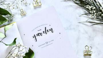
Cover Page
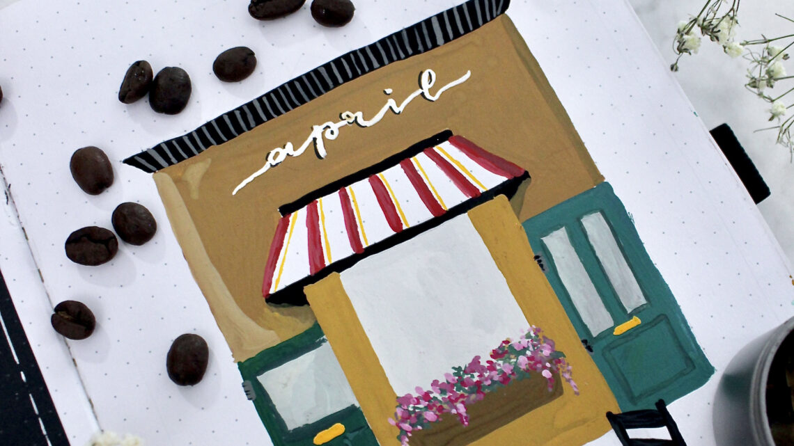
Picture this. You are outside of coffee shop on a nice warm day sipping your drink (hot or cold… up to you) and you just feel at piece. To start this journey of a coffee shop theme I wanted it as if you were entering the building itself. Since drawing buildings is not something that I generally do, I did end up browsing through Pinterest to see the different coffee shop items that I could include in this bullet journal spread. That is one thing I really recommend doing if you are drawing really anything, having a reference shot can make the process so much easier. Now I’m not saying you have to copy and paste everything that you see from the photos you collect, take the pieces that you like and add your creative spin onto it. That’s what I ended up doing for mine!

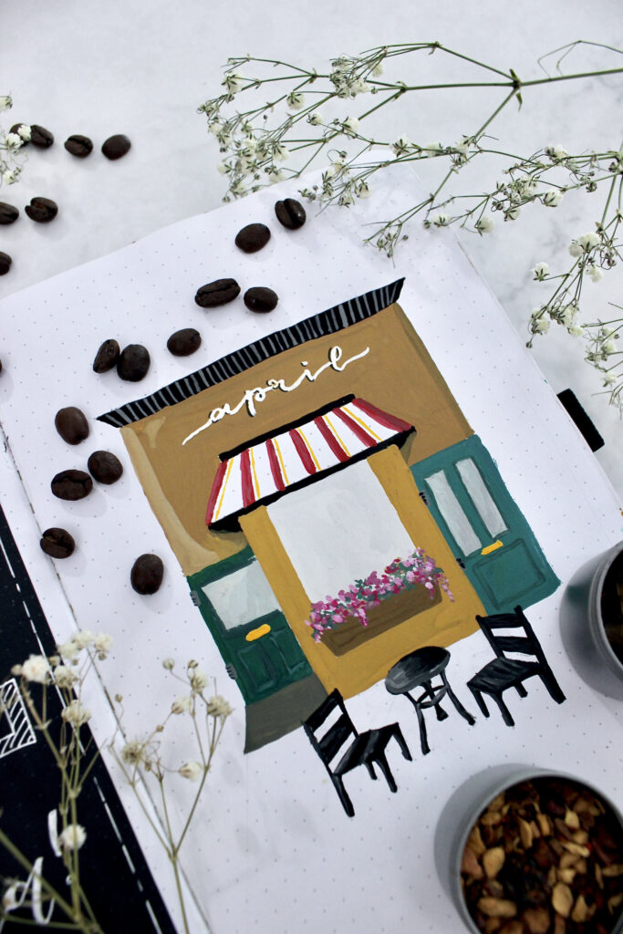
The one thing that I love about buildings in particular, is that they are comprised of different shapes. If you look at the picture as a whole, the building really just is a rectangle. On top of that rectangle there are other shapes; a trapezoid for the awning and roof, a series of rectangles for the door, a circle for the table top and so on and so forth. I am no expert by any means in drawing anything, but this tip really does help me when looking at a piece and trying to re-create it. I hope that helps you out if you are wanting to recreate this theme as well!
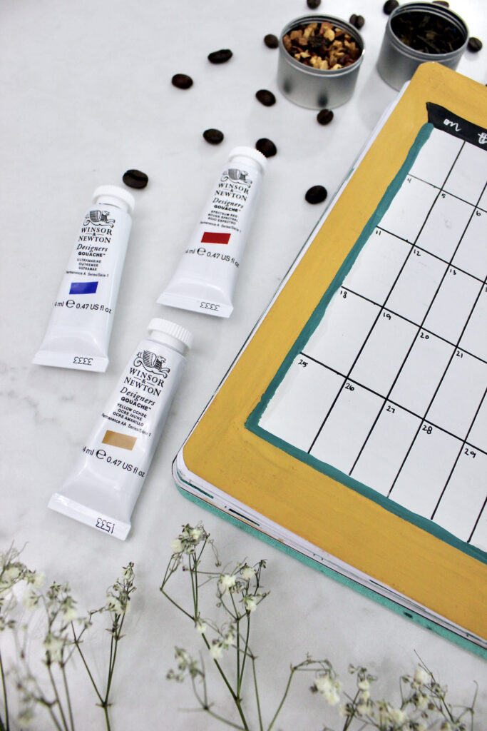
Since I decided to try out a little something different in my bullet journal, I recently purchased Windsor & Newton designer’s gouache. Here is a breakdown of the colours I used to get the looks in this spread:
- Building
- Main Building: Yellow Ochre + Ivory Black (small amount to darken)
- Highlights: Main Building + Zinc White (until desired light colour)
- Shadows: Main Building + Ivory Black (until desired dark colour)
- Doors
- Main Door: Ultramarine + Permanent Green Middle (equal parts)
- Handles: Permanent Yellow Deep
- Windows: Zinc White + Ivory Black (small amount to darken)
- Awning
- White background is the notebook
- Red Lines: Spectrum Red
- Yellow Lines: Permanent Yellow Deep
- Roof and Chairs
- Ivory Black
- Line Details: Zinc White + Ivory Black (small amount to darken)
- Flower Box:
- Brown Box: Ultramarine, Spectrum Red, Permanent Yellow Deep (equal parts)
- Flowers: Spectrum Red + Zinc White (different shades and tints)
- Greenery: Permanent Green Middle
Make note of these colour combinations because they are the exact same that I use throughout the rest of the set up!
Quote Page
It feels like it’s been a while since I’ve done a quote page, when in reality it has only been a month. For this part of the bullet journal set up I wanted to have a chalkboard message that you might see when entering a coffee shop. On the quote page it ends up saying “sometimes all you need is a good book and a cup of tea – every morning”. I actually have a mug that says just this, and it was the inspiration for the quote page this month. I have to say there’s something therapeutic about writing down a saying that you want to live by for the month. That is something that I try to do every month when planning out my bullet journal. I’ve noticed over the month of March that I have had a go-go-go mentality. Life in turn made me slow down by getting tonsilitis halfway through the month and forced me to take a break. This month I am trying to prioritize a bit more me time and for me that means sitting down and reading a book with a cup a tea.

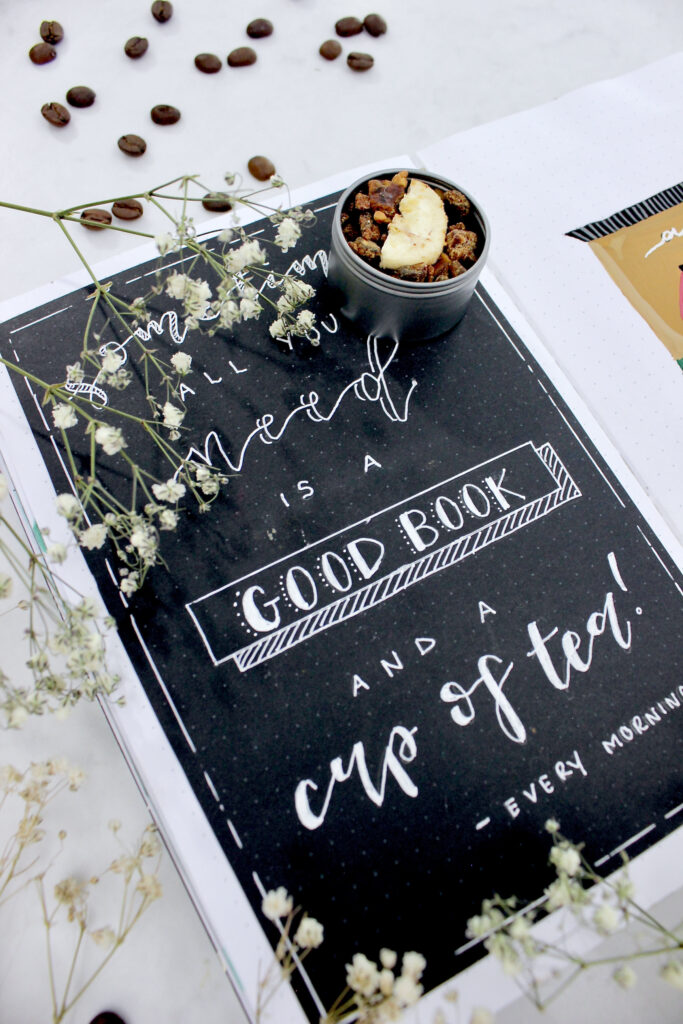
How I created this page specifically was using my black paper from Archer & Olive, my white Gelly roll pen in the size 08, and crafters tape to put it in my journal. I have to say crafters tape is one of those lucky finds that I am so happy I have in my stationary arsenal. When creating a quote page the one thing that I like to do is make sure that there are similar elements throughout the page. You can see that I love having a calligraphy style present in my page with the words “sometimes”, “need”, and “cup of tea”. Although all of them have the same calligraphy style, I did end up switching up a few things to make sure that each word stood out on its own. The first word with hatching, the second word with a drop shadow, and the third word with thick down strokes.
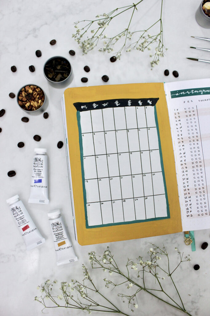
Monthly Calendar
Moving into the coffee shop this calendar view shows the window portion of the shop. I wanted it to feel like you were walking into the coffee place and looking out the window. So that colouring of the calendar is the exact same colour as the windows, and the border around the window is the exact same colour as the main building. I love having a traditional grid calendar layout in my bullet journal. I find it gives me enough room to write down exactly what I want to get done throughout the month, and provides me a visual of what number falls on the day of the week. The whole calendar is 10.5 cm long by 15 cm tall (21 dots x 30 dots), with each individual box being 1.5 cm across by 3 cm tall (3 dots x 6 dots). The calendar was centred on the page, so that yellow border could shine through.
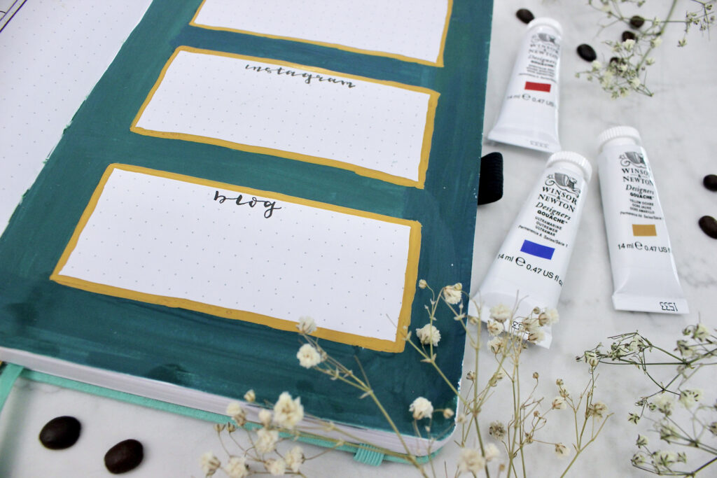
Content Calendar
From my March plan with me, I really liked having a specific page dedicated to my content calendar. However, the one thing that I noticed was I didn’t use it as much as I would’ve liked to because it was separate from all my other pages. I’m hoping by putting the content calendar right next to my monthly calendar this month, I will use it more since it is easier to reference. I am going to be focussing this month on my Instagram. I noticed that I didn’t generally use the area that I dedicated for my blog posts and my YouTube as they only happened once a week. Now I know not everybody uses a content calendar in their bullet journal. The nice thing about this spread specifically is that it can work for a variety of different things. You could have this being used for a physical health tracker. Writing down exactly what type of physical activity you had that day: cardio, weight and resistance training, or a rest day.
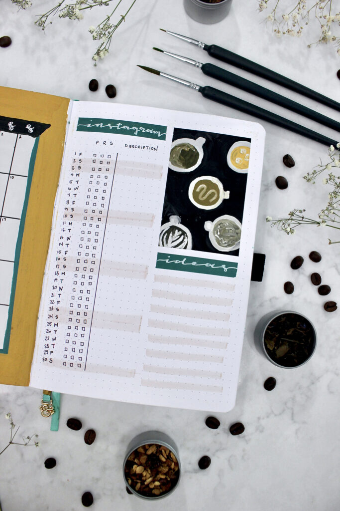

The top part of the page I ended up putting in a doodle of different coffee or tea items that you could get while at a café. The nice thing about this drawing in particular is that each of the brown colours originated from the exact same base colour, and then adding in more white to lighten or black to darken. The only exception to that is the top iced coffee colour where I used the main building colour again just to tie the two pages together better.
Gratitude Log
If you could order yourself a perfect day what would it look like? For my gratitude log this month I really wanted to show some things that made me happy. On the left-hand side of the page I ended up cutting out a 6 cm x 19 cm (12 dots x 38 dots) black paper from Archer & Olive to make the chalkboard sign of things that I liked. Since this is a coffee shop theme, I started off the quotation saying “something sweet, something salty, something hot, something cold” and put in different things that make me happy. Specifically in spring it is the sunshine and the flowers blooming, but also some things that I want to start doing more in the month April; reading and walking.

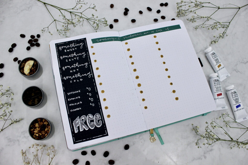
I divided the page in half on both the left and right side, leaving three lines for each day to write out three things that I enjoyed. My goal is to write this out before I go to bed or right in the morning or the next day about the three things that I was grateful for. I did pull out my gouache paints for the header, using the same teal colour as the coffee shop doors. As well as the yellow ochre colour for the dots going down the page.
Walking Tracker
Now that the weather is getting nicer, I really don’t have an excuse up in Canada for why I am not walking. I can just simply throw on a light jacket and walk out the door instead of getting on all of the paraphernalia that goes along with winter outfits. The walking tracker represents an iced drink and is sectioned off into 30 different areas for me to track what my walking looked like. Not only do I want to track if I walked during that day, but how much I walked.
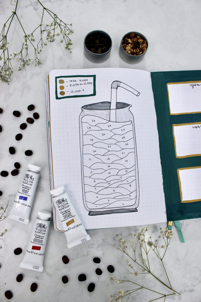
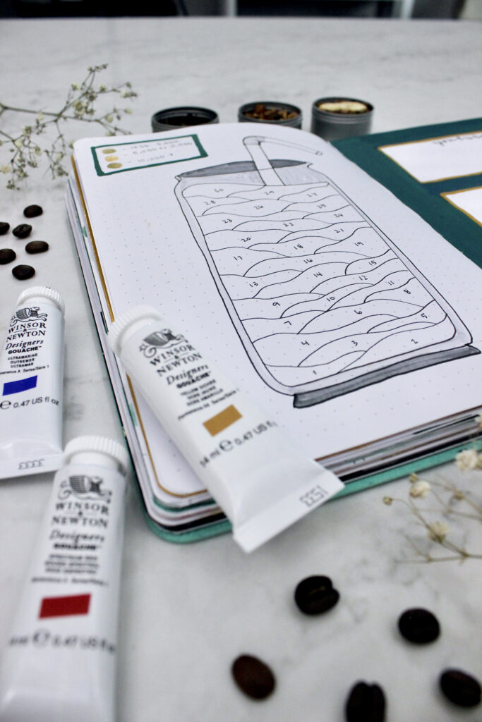
So up at the top of the page I ended up putting in a little legend with three different brown tone colours. From lightest to darkest, the three colours represent less than 5,000 steps, 5,000 to 10,000 steps, and 10,000 or more steps. The middle tone is my base colour and I added white to make the first colour and black to make the third colour. Since I want to make this easy for me, my plan is to pull out my gouache paints on the weekend and fill in the week’s steps. I hope to have at least 5,000 steps every single day, but I’m curious to see how my walking will be affected now that the weather’s warmer.
Goal Tracker
So far every month of this year I’ve had at least one dedicated page for my goals. This month I have sectioned off one full page for my YouTube, Instagram, and blog goals. Here’s where I’m going to mark down at least 2 to 3 goals for each section. I will still be continuing this month my one-page weekly spreads so I can have my goals for the week right in view of my daily tasks. Last month I found this really helpful when planning out my bullet journal, because I was more likely to actually do what I said I was going to do. The background is the same teas colour and the yellow colour matches the main building. Are you also the type of person who needs something right in front of their face otherwise you’ll forget?

Reflection Tracker
I found it interesting looking back at my March monthly reflection. It’s entertaining sometimes to see what yourself was thinking a month ago. The three questions that I asked myself at the beginning of the month were “how am I feeling?”, “how will you prioritize relationships?”, and “how will you prioritize yourself?”. My responses to these questions were along the lines of I’m feeling determined, I’ll plan things out in advance, and I’ll provide time for rest and relaxation. Let me just say that March has been very eventful in more areas than one. I ended up getting tonsillitis, which forced my body to relax and prioritize myself. My family dog passed away at the end of the month, which allowed me to engulf myself in family and friend support. And my feeling of determination, although was directed towards putting out consistent content this month, ended up changing to being all the more determined to make this my career.
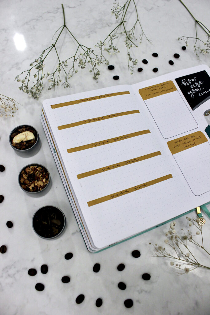
For April I wanted to break down my thoughts and feelings each week into a few sentences; really taking the time to write down my life. I did like seeing what my thoughts were going into the month, and writing down what I was most proud of, so I left those sections in on the right side of the page. I wonder how my April reflection will compare to my March reflection. Honestly, I really think that this will be a staple spread of mine going forward.
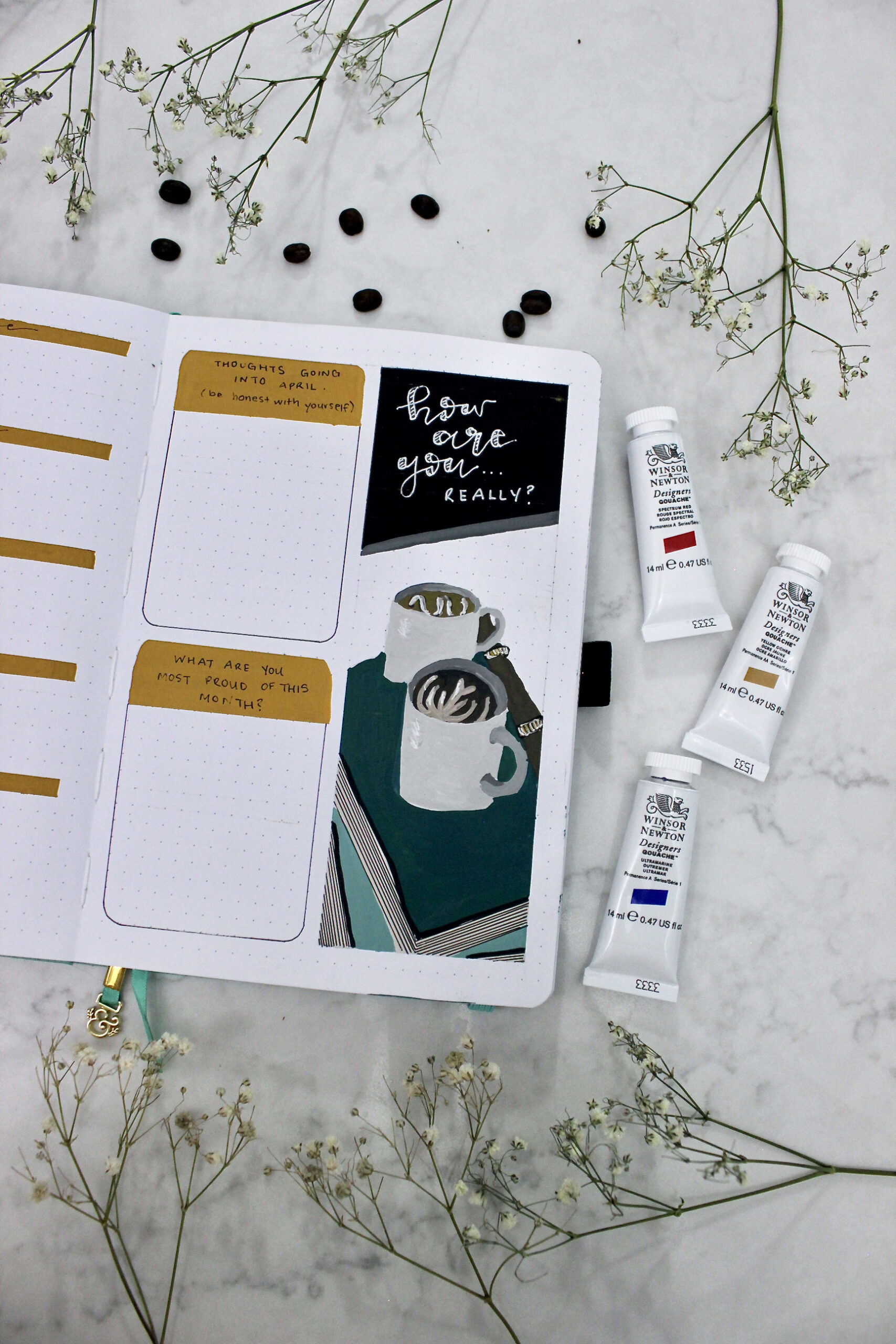
The painting on the right included two books and two coffee mugs along with a title saying “how are you… really?”. The colours of the book I started off with that regular teal colour from the front page and then added a little bit of white for the lighter blue colour on the bottom. Personally, I find that a page is more cohesive when you have similar toned colors. The best way to do that for me personally is to either add a little bit of white to make the colour lighter or add a little bit of black to make the colour darker. Either way you know the colours are going to work with the other ones on the spread. For the lines on book I came in with my micron pen in the size 01. I did notice however when using these pens over top of the gouache, like watercolor, you need to allow the paint to fully dry.
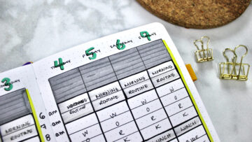
Weekly Spread
If you haven’t already read my blog post all about the different one-page weekly spreads, I recommend you read that as it really breaks down how to create a weekly page in your bullet journal. I am using two of those spreads in this week’s layout. First, I came in to border off the coffee bean section. Starting off with a black gouache background, I waited for that paint to dry completely before coming in with the brown details. The coffee beans were really simple to draw out, with just two lines next to one another going all the way up the page. If you like you can always switch up some of the brown tones by adding in a little bit more white, black, or red to make the beans a little different (that’s what I ended up doing).
The yellow dot section will be completely dedicated for my goals for this week. When filling out this section in my journal, I look at what my monthly goals are and what I can accomplish in the first week to make that a reality. Each day I end up writing down one thing that I want to get done that day for each individual goal.
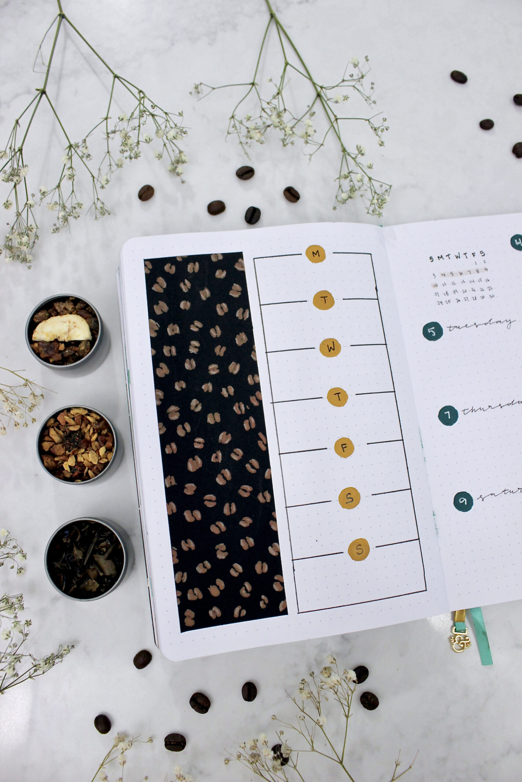

The right page I divided into eight equal sections with the first box being dedicated towards a monthly calendar. I am a sucker for calligraphy, so I ended up choosing a dainty style lettering by using my Mircon pen in the size 03. Each of the dots are that teal colour with the gelly role pen over top for the numbers.
Final Thoughts
Not to be biased but I think that this is my favourite theme that I’ve done so far and I will for sure be using gouache paints in my journal again. I can’t wait for the month of April to start and begin filling in all of these trackers. If you are interested in seeing what these spreads look like filled in I do a monthly bullet journal flip through on my Instagram along with more photos and reels as well!
Let me know what your plans are for April… maybe we are planning the same thing!